Welcome to a special Bad Movie Twins bad movie data analysis post. I haven’t done one of these in a while, but it was high time I started refining my machine learning / data viz creds again. Recently I have been going through the process of collecting a large data set of movie information for use in analysis. This is the first fruit of that labor.
First, the briefly describe the data set. Collected via the BoxOfficeMojo.com yearly box office listings (e.g. For 2010) I collected the top 200 movies by theater count (ultimately this is something like every movie Box Office Mojo has on record released to 300 or so theaters back to 1980). These are Box Office Mojo links. I then meticulously collected the Wikipedia, IMDb, and Rotten Tomatoes links for all of these films (around 7500 films in total). The set ultimately included Rotten Tomatoes review / fresh counts, consensus, etc.; IMDb title, year, genres, etc.; Box Office Mojo gross and theater count, among other things. Eventually I would like to develop a model out of this data, but I wanted to first test out some hypothesis testing on it just to see how it performs.
One of the main things I’ve always been curious about Rotten Tomatoes data in particular was how the review number / freshness has changed over time. My initial priors were: (1) There are far more reviews from 2000 onward than prior to 2000, this is just my anecdotal experience; (2) More recently there have been more reviews and in general, and reviewers have been kinder. Again, just anecdotal. So why not test these hypotheses? So first a quick visualization:
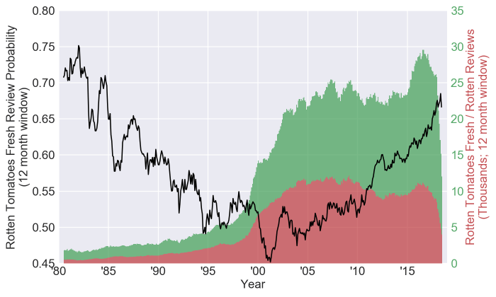
So the first plot here shows two things. First, the probability of a fresh review from a rolling 12 month window for movies that have at least one review, and were released to at least 600 theaters (black line, left axis). This is calculated by summing all fresh reviews and dividing by the total number of reviews on Rotten Tomatoes for that 12 month span (so not an average TomatoMeter, although that generally has the same shape, just shifted downwards). Secondly, it shows the total number of fresh (green filled area) / rotten (red filled area) reviews in the 12 month window (right axis).
The main thing that pops out to me is that when you move backwards and forwards in time from around the year 2000 the “freshness” of the reviews seems to increase. But interestingly the first reason I proposed for why this might happen, the number of reviews increasing, isn’t actually true when you move either way. The review count decreases as you move into the past, and moving forwards in time there is an initial increase, but for the most part the total number of reviews has been pretty stable over the last two decades. The plot does seem to suggest that, maybe, reviewers are getting kinder over time though, so what is happening?
My next though was that the trend is a manifestation of “review inequality”. As you move backwards in time the number of films getting after-the-fact reviews placed on Rotten Tomatoes dwindles, and thus an increasing number of reviews end up being submitted for the best films of the year for the most part, thus the reviews will become increasingly fresh. Alternatively, as you move forwards in time more and more of the “small” reviewers on Rotten Tomatoes are added and they will tend to only review a subset of the, mostly good, major releases. So again, as you move forwards the bigger and generally better regarded films will get a larger and larger share of the reviews.
And an easy test of this hypothesis is to look at something like a Gini Coefficient. There are a multitude of complaints about the Gini Coefficient (as outlined in the wikipedia page), but considering it is a general first step in income inequality analysis, I decided to toss a flyer out there and see if the Gini Coefficient could tell us anything about whether my hypothesis holds water:
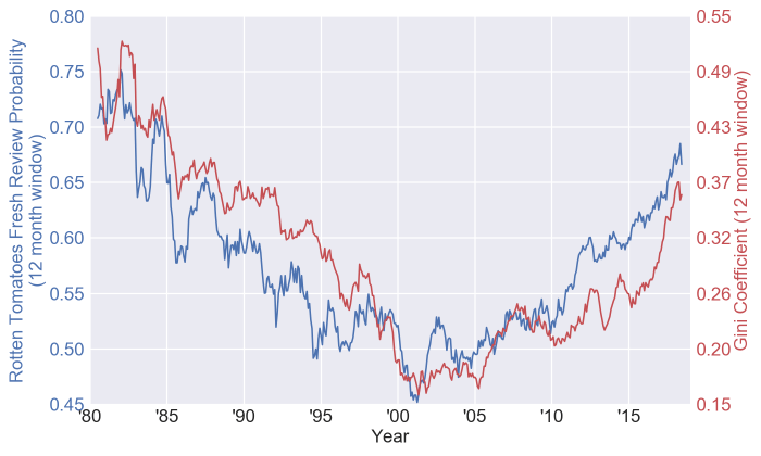
And what do you know, the plots are eerily similar. I had figured that this was all a single phenomenon, but the two domains (before somewhere around 2000 and after) do seem to act different. Here is the same plot transformed a bit:
This actually looks like there could be a good partition around the year 2000. So where does the data partition? One (likely simplistic) way would be to develop a piece wise linear regression on the Gini plot and point out the spot where the two regressions meet:
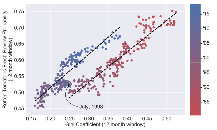
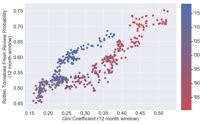
Now that’s pretty cool. July, 1998, was around the point in time (almost to the month) when Rotten Tomatoes was launched. As a matter of fact, for the analysis below I will treat the partition as specifically the launch month of August, 1998. I think the obvious hypothesis as to why the Gini coefficient correlates positively (and shockingly well) with the review probability is that the higher the number of reviews the higher your TomatoMeter tends to be. So when a high percentage of the reviews are distributed to a small number of movies that will drive the overall freshness of Rotten Tomatoes up. And just to hammer home the point as to why this partitioning is particularly interesting, here is a scatter plot of the Rotten Tomatoes reviews and the TomatoMeter for all of the films since 1980 which were released to 600 or more theaters and have at least one review on Rotten Tomatoes:
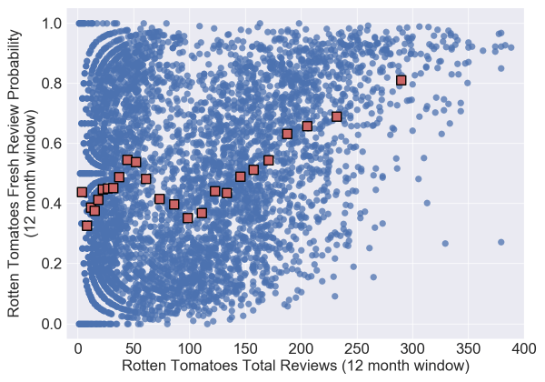
Super weird. The red squares are formed by grouping the data into 25 groups and taking the mean value. Note that this plot suggests that a movie is more likely to be good if it has around 50 reviews instead of, say, 100. Which without further testing you might think is due to independent movies or some other small-movies-are-better effect. But now let’s split the data by the Rotten Tomatoes launch date and treat movies which were released before (and backfilled) and movies which were released after differently:
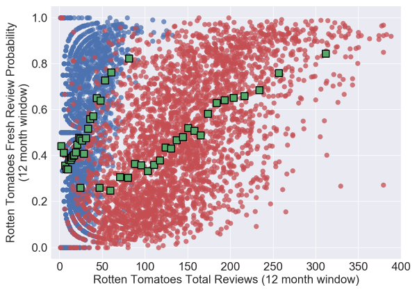
And now you could come to a different conclusion. Both sides uniformly increase in quality with the number of reviews, it is just that backfilled films tend to have fewer reviews in total. Almost all movies released prior to Rotten Tomatoes launching have less than 100 reviews on Rotten Tomatoes, a number which today would represent a fairly small release.
I’ll leave the analysis there (this is already incredibly long), but I found this all very interesting and I think it shows the power of analyses like this. If I were to make a model to try and predict a film’s TomatoMeter using the total reviews as an input, for example, and wanted it to apply backwards in time, this analysis strongly suggests that you either want to (1) treat a movie released before and after Rotten Tomatoes was launched differently, or (2) Build a time dependent factor that can build this partition in for you. Again, I like the analysis because this isn’t a totally obvious result in my opinion, and it gives a simple and easy to follow guideline for eventual use in modelling.
And as for my hypotheses? There are indeed fewer reviews prior to 2000 than after, drastically so. But interestingly if you look at the piece wise regression on the Gini vs. fresh review probability plot above it actually kind of suggests that given the amount of inequality with how the reviews are being allocated, that the films are actually getting worse reviews in the last 2 years than between 2000-2016. Which is something I think I’ll want to explore more in a second installment of this series.
Hopefully I’ll get that analysis up soon, but I’ll probably start looking at building a simple predictive model as well. I will say the data set I’ve collected, while it takes ages to update, has already been incredibly useful in finding and analyzing potential BMT films.
Cheerios,
The Sklogs

One thought on “Bad Movie Twins Bad Movie Data Analysis #1”